Conference Title Block: Horizontal
The conference title block should be consistent across print and digital materials.
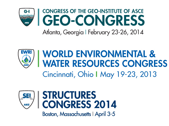
The appropriate logo appears first and is separated from the conference block text by a vertical line. The height of this line equals the height of the conference title and the weight is no heavier than 3 points. The space on both sides of the line is equal to two letter spaces. The logo should be vertically centered with this line.
The conference title is set in Futura Standard Heavy, all caps.
The conference location and date follow and are set in Futura Standard Book, upper and lower case and should be at least five point sizes smaller than the conference title. This information is flush left with the conference title. In general this line should be about the same width or less than the longest line of the conference title.
The location and date is separated by a vertical line that reflects the same weight of a vertical letter form and is a different color than the text. The space on both sides of the vertical line is equal to two letter spaces. In instances where legibility is an issue, this information can appear on two lines.
If the year is included in the title, it does not need to appear a second time. The state name is always spelled out, never abbreviated.
Condensing or expanding the fonts is not recommended.
When horizontal space is limited, there is a vertical version of the logo that should be utilized. This version of the title block can be found here.