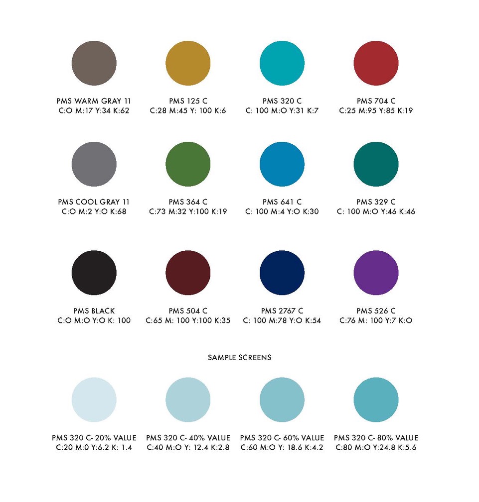
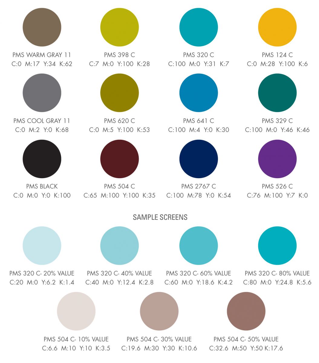
Primary Color Palette
This group of colors will create vibrant communications that complement the ASCE blue and green. Shown here as PMS ink colors and as CMYK (cyan, magenta, yellow, and black) values for 4 color printing, the entire palette is available in any tint, or screened version, to create a lighter shade.
Using the ASCE blue (PMS 286) and green (PMS 375), instead of shades that are similar, reinforces the Association’s brand. As indicated here, other blues that contrast to our official blue are allowed but are never to be used for the logo.
One of the goals with color selection is to avoid using hues that are similar to the ASCE Subbrand colors. This will avoid confusion and help accelerate the Subbrand categories.
Relevant choices from this color palette for collateral materials will help distinguish initiatives from one another and make them more memorable. For example, ample use of shades of brown (PMS 504) and gold (PMS 125) would work well for a conference in an arid climate. These hues would appropriately convey the conference location. Using blue (PMS 641) and PMS Cool Gray 11 on materials for the Student Steel Bridge Competition, would be relevant to the subject matter. Color selection should also complement any photographs that may be used.
To view a large version of the color information to the right, you can either click the image or click here.