Website and Email Banners
Standard sizes for website and email banners are as follows:
- Website and Paper Management System banners are 600 x 100 pixels.
- Email banners are 600 x 100 pixels.
Jpg is the preferred deliverable format for these banners.
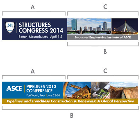
It is recommended that each banner be broken up into quadrants as shown to the right and described below. This will provide consistent placement of information and create a cohesive identity for each conference.
If a different design direction is chosen, the "conference title block" guidelines will need to be followed. Those guidelines and templates can be found here.
A) CONFERENCE TITLE BLOCK
The title block should never be placed on a photograph or illustration. A solid contrasting background color is recommended. Color selection guidelines can be viewed here. The horizontal title block should be used. Guidelines and templates can be found here.
B) CONFERENCE THEME
The theme should be set in Futura Standard bold italic, upper and lower case. The conference theme should never be placed on a photograph or illustration. A brighter accent color is recommended for the background to highlight the information. This area can extend the full width of the banner or extend the width of either the conference title block area or the theme/location feature area as shown in the SEI sample. The "conference title block" area should be framed with a 2 point white rule.
If there is no theme, this area can be used to highlight other important information. For example, in the SEI sample, they have highlighted that SEI is an ASCE Institute. Information that is not considered the conference theme, should be set in Futura Standard bold, upper and lower case.
C) THEME/LOCATION FEATURE
The "conference theme" area and "theme/location feature" area should be separated with a 2 point white rule. This area can feature photos and/or illustrations that highlight the conference theme and/or location. The number of photos/illustrations should be limited to three. If using photos, a 2 point white border around each photo is recommended. The hues of the photographs/illustrations should compliment the colors chosen to represent the conference.