Flyers
Flyers have been broken up into quadrants to allow for consistent placement of information and to create a cohesive identity for each conference.
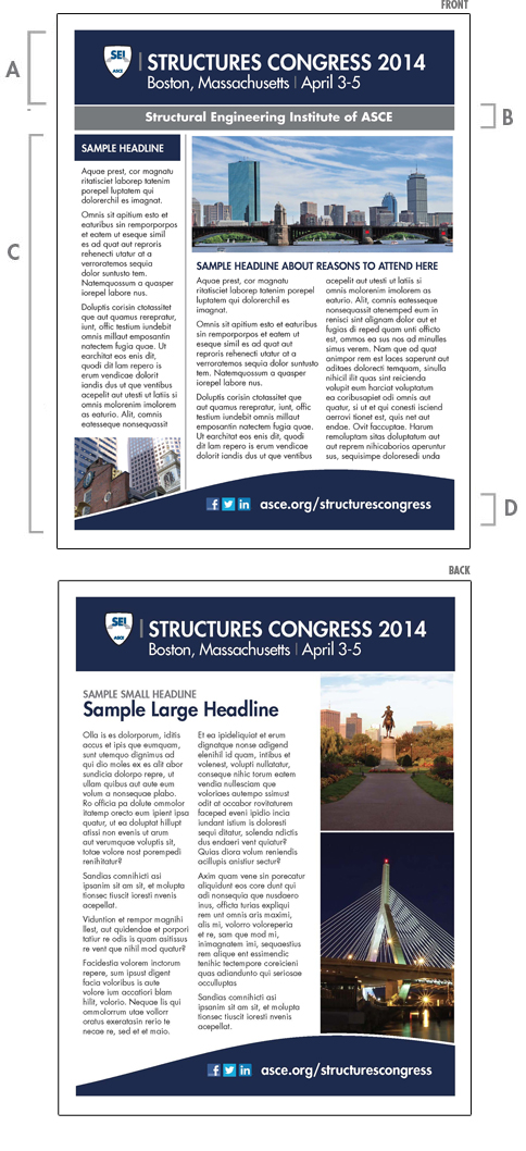
A) CONFERENCE TITLE BLOCK
The title block should never be placed on a photograph or illustration. A solid contrasting background color is recommended. Guidelines and templates for creating the conference title block can be found here.
B) CONFERENCE THEME
The "conference title block" area and "conference theme" area should be separated with a 2 point white rule. The theme is set in Futura Standard bold italic, upper and lower case. If there is no theme, this area can be used to highlight other important information. For example, in the SEI sample, they have highlighted that SEI is an ASCE Institute. Information that is not considered the conference theme, should be set in Futura Standard bold, upper and lower case. The theme does not need to appear on the back of a two page flyer.
C) FLYER TEXT AND IMAGES
The arrangement of the elements in this area should focus on readability, prioritizing information and be visually pleasing. The SEI example illustrates an effective sample layout.
D) LOCATION/WEBSITE/SOCIAL MEDIA
The "flyer text and images" area and "location/website/social media" area should be separated with a 2 point white rule. All text in this area should be set in Futura Standard heavy, upper and lower case. The location of the conference and lodging information can be featured here along with the conference website and relevant social media icons.