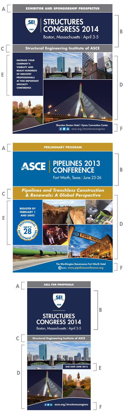
Promotional Covers
All promotional material covers have been broken up into quadrants to allow for consistent placement of information and to create a cohesive identity for each conference.
A) COVER DESCRIPTION
The "cover description" should be set in Futura Standard extra bold, all caps. This section is highlighted by using an accent color for the background. If an accent color has been chosen for the vertical bar in the title block area (see below), it can be repeated here to create a consistent look. Color selection guidelines can be viewed here.
B) CONFERENCE TITLE BLOCK
The "cover description" area and the "conference title block" area should be separated with a 2 point white rule. The title block should never be placed on a photograph or illustration. A solid contrasting background color is recommended. Guidelines and templates for creating the conference title block can be found here.
C) CONFERENCE THEME
The "conference title block" area and "conference theme" area should be separated with a 2 point white rule. The theme is set in Futura Standard bold italic, upper and lower case. If there is no theme, this area can be used to highlight other important information. For example, in the SEI sample, they have highlighted that SEI is an ASCE Institute. Information that is not considered the conference theme, should be set in Futura Standard bold, upper and lower case.
The background color should match the background color selected for the "publication description" area.
D) THEME/LOCATION FEATURE
The "conference theme" area and "theme/location feature" area should be separated with a 2 point white rule. This area should feature photos and/or illustrations that highlight the conference theme and/or location. Photo and illustration selection guidelines can be viewed here. This area can vary from one publication cover to another for a specific conference but should look consistent. This area can also feature marketing text and Professional Development Hours (PHDs) when applicable. See below.
E) MARKETING TEXT/IMPORTANT INFORMATION/PDH'S
Marketing text can be placed anywhere in the "theme/location feature" area and must always appear on a colored background and never directly on top of photographs or illustrations. A 2 point white rule can be added around the color block to further highlight the information. A seal has been created to highlight PDHs as shown in the Pipelines example. This seal can be downloaded in eps format here.
F) LOCATION/WEBSITE/SOCIAL MEDIA
The "theme/location feature" area and "location/website/social media" area should be separated with a 2 point white rule. All text in this area should be set in Futura Standard Heavy, upper and lower case. The location of the conference and lodging information can be featured here along with the conference website and relevant social media icons.