Color Selection
Color selection for conference materials is an important component that helps build immediate recognition. It also helps differentiate conferences put on by the same organization within the same year. Care should be taken to choose unique color palettes.
ASCE sponsored conferences should feature colors that complement ASCE Blue PMS 286C. The primary color palette can be found here, the accent color palette can be found here, and the metallic color palette can be found here. Please note, accent colors and similar colors are not recommended for large areas on any publication or communication product. Color selection is not limited to the color palettes in place for ASCE materials but is recommended.
Institute sponsored conferences should feature the official colors of each of the Institute logos as well as the corresponding, complementary color palette. Click on the links here to view the color palette for each Institute: AEI, CI,COPRI, EMI, EWRI, GEO, SEI, and T&DI. Please note, accent colors and similar colors are not recommended for large areas on any publication or communication product. Color selection is not limited to the Institute color palettes but is recommended.
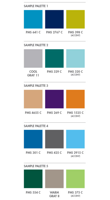
Sample PMS color combinations are shown on the right for inspiration. Please note, accent colors and similar colors are not recommended for large areas on any publication or communication product.
To view a large version of the color information to the right, you can either click the image or click here.